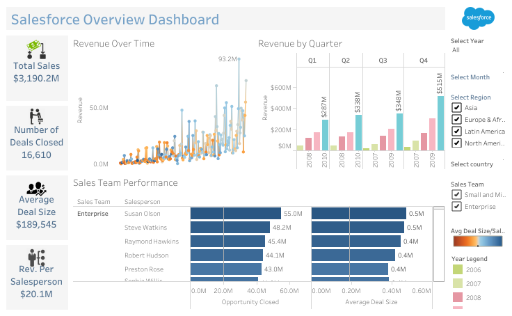
This Dashboard gives the viewer an overview of total Sales for a particular period, region and the information about the sales team who closed the deal. Total number of Deals Closed by region, Average Deal size as well as Revenue generated by a sales person. The report is dynamic, so user can select the period, Regions, Country as well as sales team to check the performance. The Dashboards can be customized as per the client’s requirements. It’s a lot more easier to view in a form of charts then excel sheets. It can be build with a variety of chart types, and you can customize how data is grouped, summarized, and displayed for each Insight.
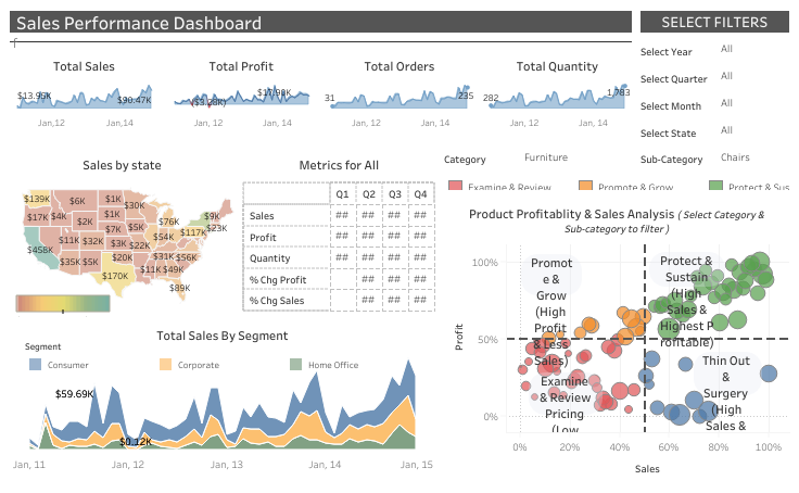
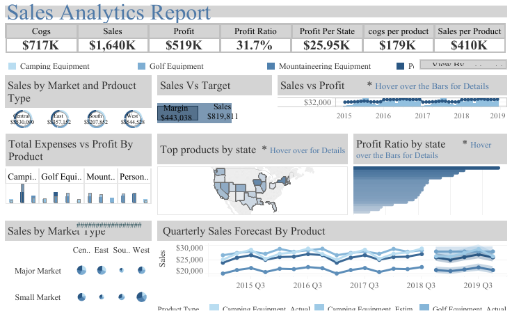
Sales Performance Dashboards are a great way of highlighting important data of your organization. By customizing your dashboards, you can focus on the numbers that matter to your organisation while simultaneously creating real time daily sales reports that are constantly updating to reflect the new sales that have been made by different regions, state etc for a particular period of year. Report can also be drill down to quarterly or Monthly performance as well. Sales Dashboard reflects the insights about product profitability by each level. Managers can focus on which products needs more attention and which products are profitable.
A “What-if” analysis is the process of changing the values a parameter to see how those changes will affect the outcome of data. In order to be able to evaluate beforehand the impact of a strategic or tactical move so as to plan optimal strategies to reach their goals, decision makers need reliable predictive systems. What-if analysis is a data intensive simulation whose goal is to inspect the behavior of a complex system, such as the corporate business or a part of it, under some given hypotheses called scenarios.
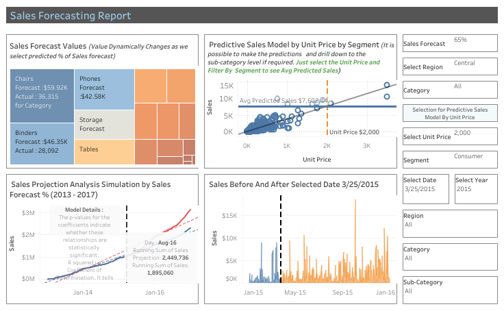
Tableau empowers sales teams to accelerate analysis and make a greater impact with their business data. From tracking quotas to pipeline, Tableau helps sales teams transcend report building and perform trustworthy analysis from a single source of truth that decision makers can rely on. With Tableau, the entire sales organization is equipped with shareable, actionable insights that help illuminate what’s working and what isn’t, where the opportunities are, and what needs to be prioritized to scale the team’s success.
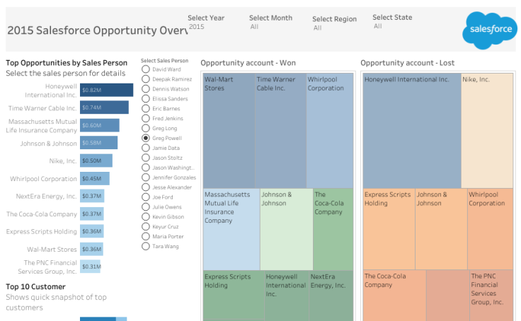
The Dashboard gives a snapshot of Top 10 Customer, Sales person and overview of total Opportunities closed-won during a period and region. Marketing team can make their efforts more focused. Lead Tracking and opportunity management dashboard helps user Track open and closed opportunities for the Year/Month, Region & State as well as Understanding the progress made by looking at closing trends of large Deals Closed. Understand and manage your inbound lead flow as well as consider Large opportunities / deals that matter. Evaluate the performance of each sales person from top Opportunities closed by sales person.
Use marketing dashboards to track key metrics to measure all your marketing efforts. Modern marketers use sensible and scientific approach to data and analytics. Our Marketing Dashboard reconcile these qualities by providing teams with visually appealing and easy-to-read displays of key marketing metrics. By tracking metrics on a daily, weekly, and monthly basis, marketers can act on data to immediately improve performance. At its core, a marketing dashboard answers the question, “How are we performing right now? “and “What is my ROI for all the marketing efforts and expense”.
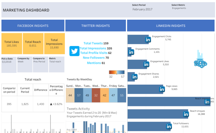
Marketing Dashboard is a comprehensive collection of insights from social media channels used by any organization performing digital marketing activities. Useful for Organization to measure the ROI from Marketing activities. With Digital Marketing activities like targeted email Marketing, advertising on social media, organization can amplify their reach. Digital advertising channels like AdWords allow organization to serve up timely ads the moment a user performs a search on Google.
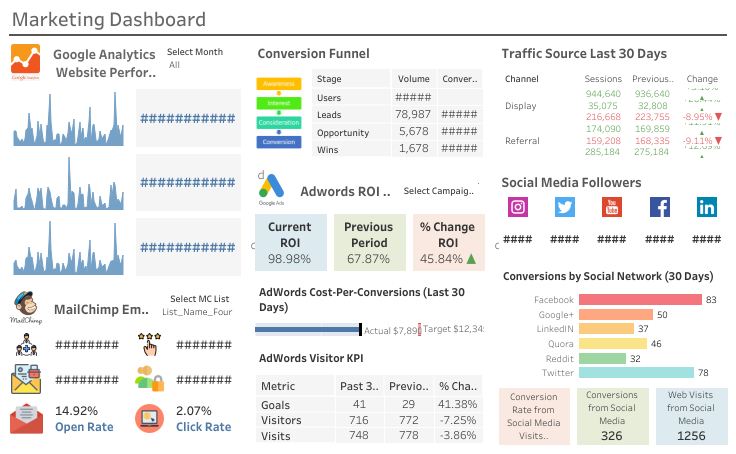
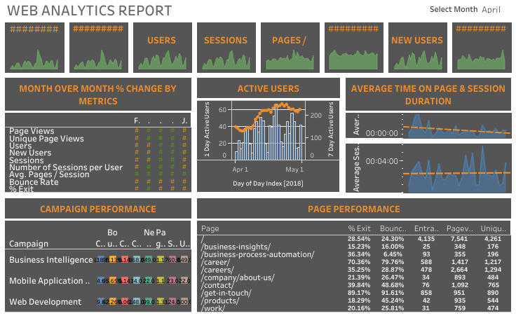
Curious what the best way to display your web analytics dashboard? Check out these example. Use web analytics dashboard to monitor your website performance by tracking metrics like visitors, pageviews, new users, bounce rate, and online conversions. A web analytics dashboard may be used in many different contexts such as digital marketing, social media, SEO, UX, and eCommerce. Each of these use-cases brings a different perspective to website performance.
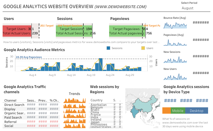
We covered how you can go beyond standard reporting in Google Analytics by using filters, segments, reports, and dashboards. Get a deeper understanding of your customers. Google Analytics Dashboard help you to analyze data for your business in one place. Get the most out of your data with features like analytics, detailed reporting, and so much more.
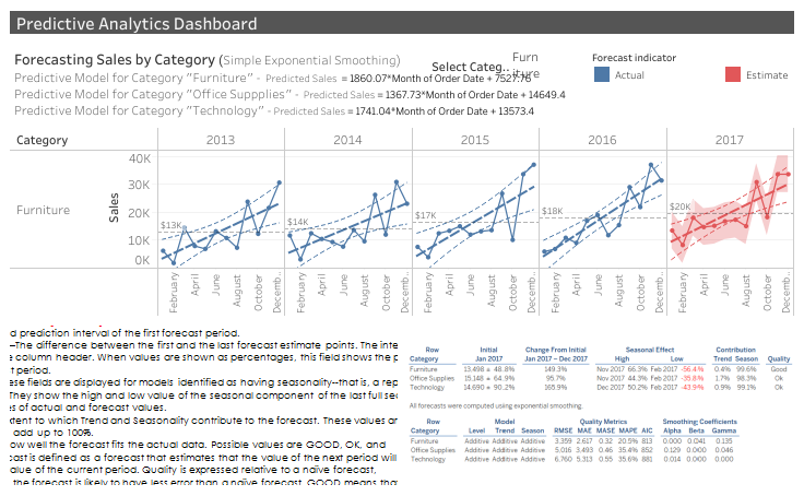
Predictive analytics Dashboard shows a graphical presentation of the current status and historical trends of key performance indicators to enable informed decisions for organizations. We can see the likelihood of a coming event or a specific situation, given the data being analyzed. Predictive analytics insights allows business users to connect to many data points, automate data retrieval, analyze, and then transform and visualize the data. This Dashboard provides Sales forecast for 1 year by different categories.
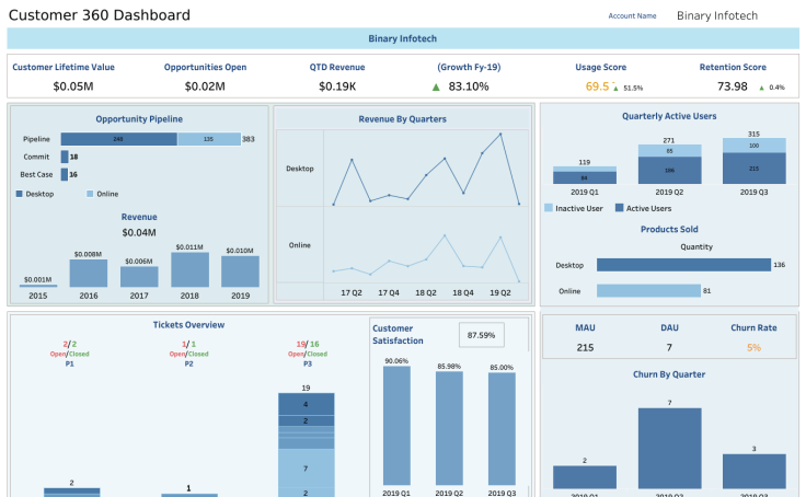
Most organizations are challenged by incomplete, inconsistent, duplicated, and fragmented customer data. This Customer 360 Dashboard will cover the main business questions we’re expecting to find in B2B activity. Dashboard for managing all your company’s relationships and interactions with customers and potential customers. Understanding how satisfied your customers might be is important from any company to know because happy and returning customers are likely to grow future revenue and profits.
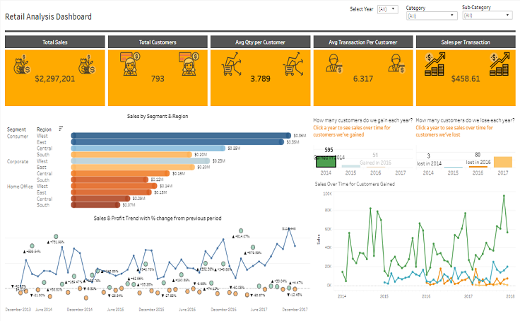
This BI solution is meant to help a retail business improve its performance in terms of profitability, with a focus on distribution processes. Like any other business, the main objective of retailers is to achieve continuous improvement in that area. Use this interactive dashboard to see performance of different brands, profile buyer segments and understand the sales funnel. Identify the most profitable sub-regions and important buyer demographics. This retail analytics BI solution will help you identify key factors that have the largest effect on profitability and improve sales force performance.
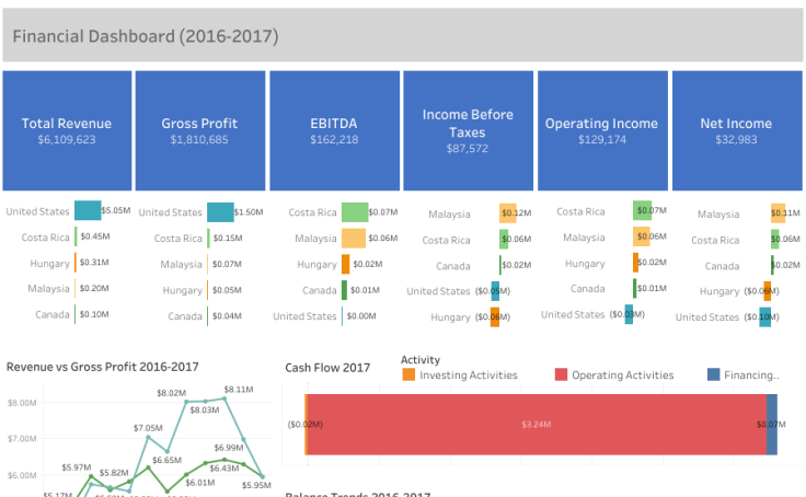
The finance dashboard provides a concise, but accurate view of business performance so executives can get the information they need “at-a-glance” to drive the business forward. The first thing that comes to mind when thinking of a finance dashboard is tracking fiscal performance. This dashboard displays financial KPIs like total revenue, gross profit, EBITDA, Operating Incomes as well as cash flow information. In the quest for brevity, however, it is important to provide executives with an easy way to get a more granular view of the business.
